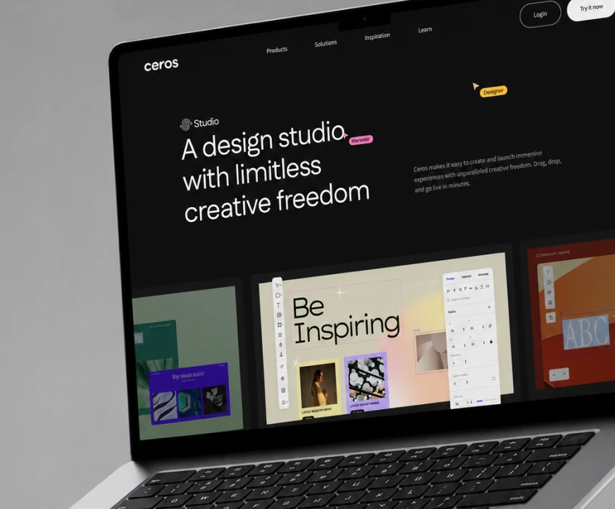
Make Content Worth Marketing

A tongue-in-cheek brand campaign for Ceros that ran from online ads to a trade-show booth, where visitors played with interactive content instead of hearing about it.

A campaign that turned the booth into the pitch

Ceros set the campaign three jobs: raise brand awareness, open new business, and grow existing accounts. Its audience, marketers and creatives, had sat through plenty of webinars and white papers, so the campaign poked fun at exactly that. Our creative director led the campaign, and I was part of it from the first brainstorm, helping shape the visual direction and pitching key visual and design ideas. I owned the campaign landing page, the INBOUND event landing page, and the event touchscreen, and helped design the booth.

Said no one ever

Every headline is something no marketer has ever said about static content, from “I stayed up late reading that white paper” to “Our webinar just won an Emmy!”, and every one ends with the same tag: said no one ever. The joke does the selling. If nobody loves a PDF, make content people actually want to engage with.

One kit, from banner ad to sticker

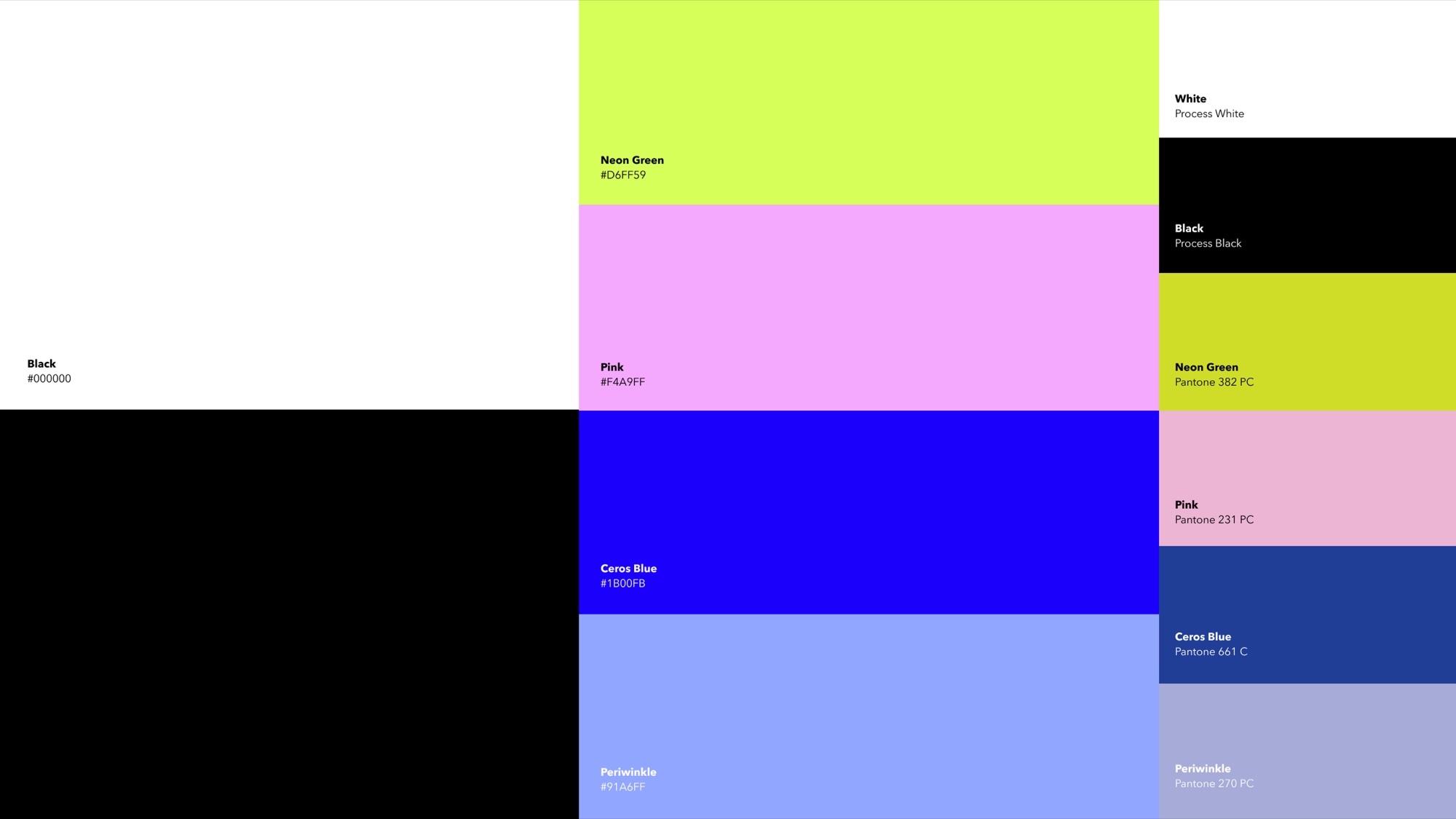
Ceros Blue stayed at the center, joined by neon green, pink, and periwinkle, with highlighter pills, sparkle bursts, and hand-drawn doodles that read as the creative process. The same kit scaled from online ads down to name-tag stickers.

Designed for the event floor

At the booth, the campaign became something to do: a touchscreen sandbox to play with, a team page for booking a chat ahead of time, and merch with a punchline that kept the joke walking the show floor.

My part

From ideation on, I contributed to the visual direction and proposed key visual and design ideas for the creative director to shape. My own deliverables were the two landing pages, one for the campaign and one for INBOUND, and CeroSpace, the booth’s touchscreen experience. I also helped design the booth itself.

Outcome

Engagement ran 1.75 times higher than the previous year’s campaign, and subscriptions 1.5 times higher. The campaign’s success also prompted the executive team to commission a full Ceros rebrand.

Company

Ceros

Role

Designer

Timeline

Mid-Aug – Oct 2023

Event

INBOUND, Boston

Team

Creative directors, creative strategist, designers, motion designer, project manager

What I did
  • Ideation
  • Visual direction
  • Key visual ideas
  • Landing page
  • Event landing page
  • Event touchscreen
  • Booth design

Said no one ever

The headline system: a line no marketer has ever said about static content, punctured by the same tag every time.
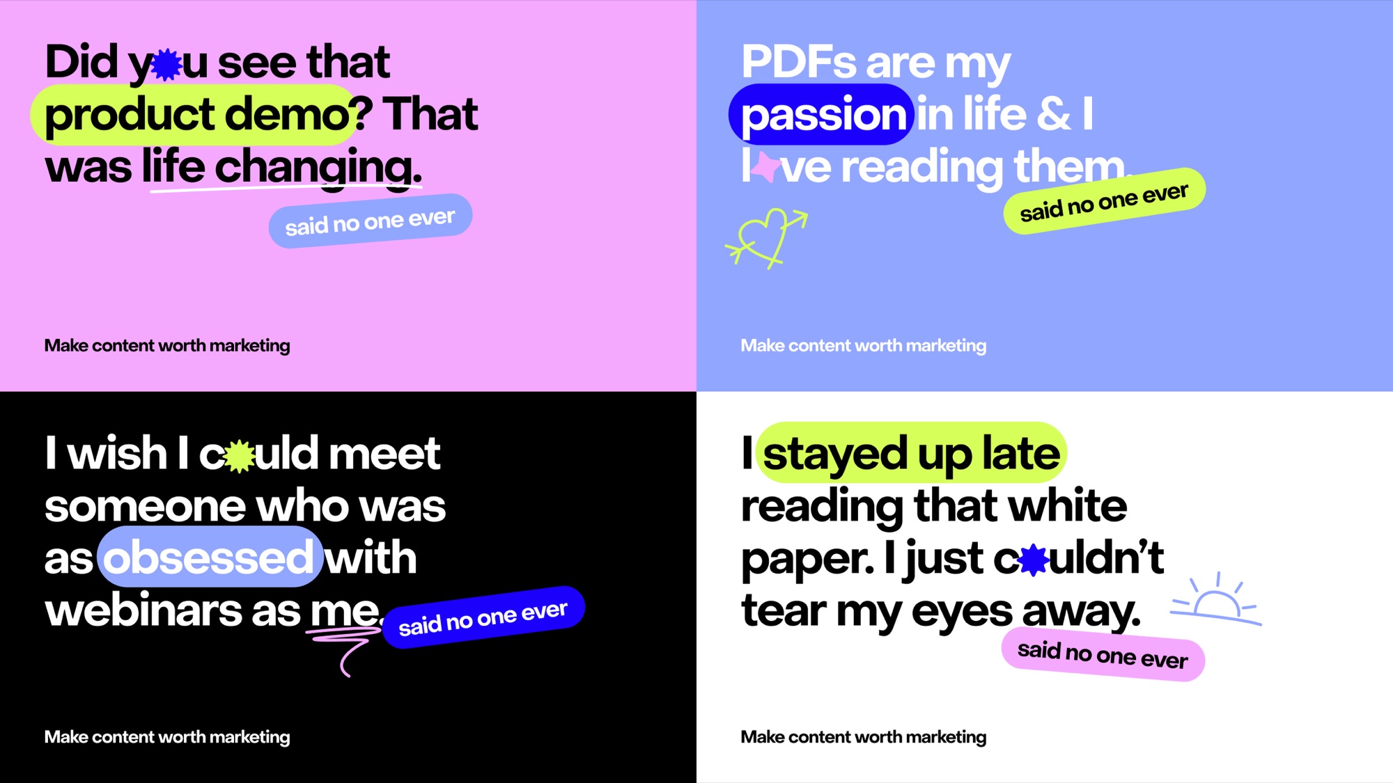
Four campaign headlines on pink, periwinkle, black and white: Did you see that product demo? That was life changing. PDFs are my passion in life. I wish I could meet someone as obsessed with webinars as me. I stayed up late reading that white paper. Each tagged said no one ever

Bold, cheeky, modular

The mood board set the tone in ten words, from bold and tongue-in-cheek to modular and fun: loud type, pill shapes, and stickers that could be rearranged endlessly.
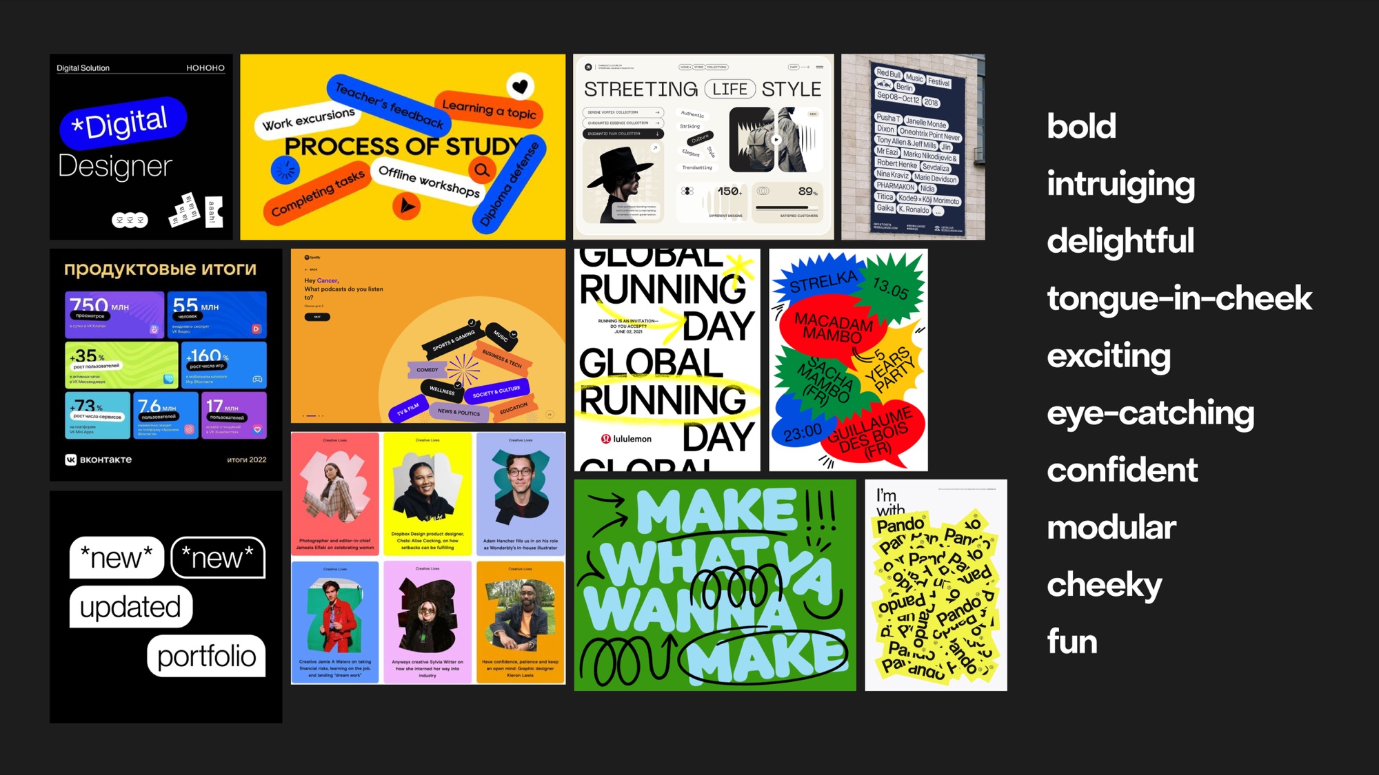
Mood board of bold editorial type, pill-shaped labels and sticker layouts, beside the words bold, intriguing, delightful, tongue-in-cheek, exciting, eye-catching, confident, modular, cheeky, fun
Campaign palette: black, white, Neon Green #D6FF59, Pink #F4A9FF, Ceros Blue #1B00FB and Periwinkle #91A6FF, each matched to a Pantone for print

Ceros Blue, turned up

Ceros Blue anchors the palette, with neon green, pink, and periwinkle for pop. Every screen color is matched to a Pantone, so the totes, stickers, and booth print keep the same punch as the online ads.

Big enough for a billboard

The campaign ran as online ads. These mockups put the same lines at street scale, to show the headline system holds up at any size.
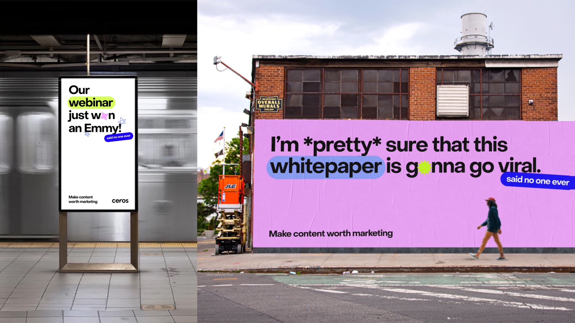
Mockups. Subway screen: Our webinar just won an Emmy, said no one ever. Wall poster: I'm pretty sure that this whitepaper is gonna go viral, said no one ever

A landing page that practices what it preaches

Floating tags, highlighted keywords, and a “What makes content worth marketing?” walk-through turned the campaign’s question into a page you explore rather than read.
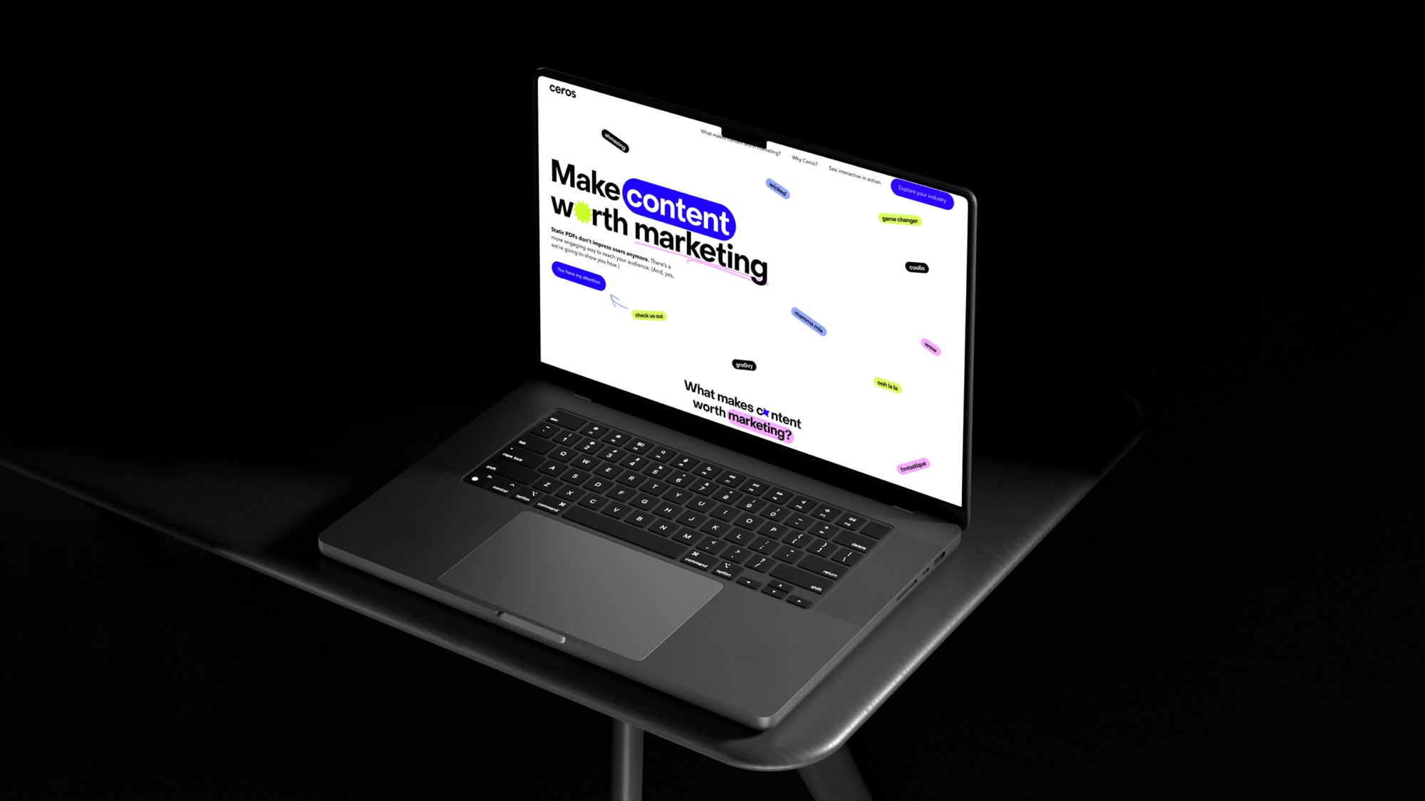
Campaign landing page on a laptop: Make content worth marketing, with floating word tags

Designed for the event floor

At INBOUND in Boston, the brief was simple: get people to the booth, give them a reason to stay, and send them home with something that keeps talking.
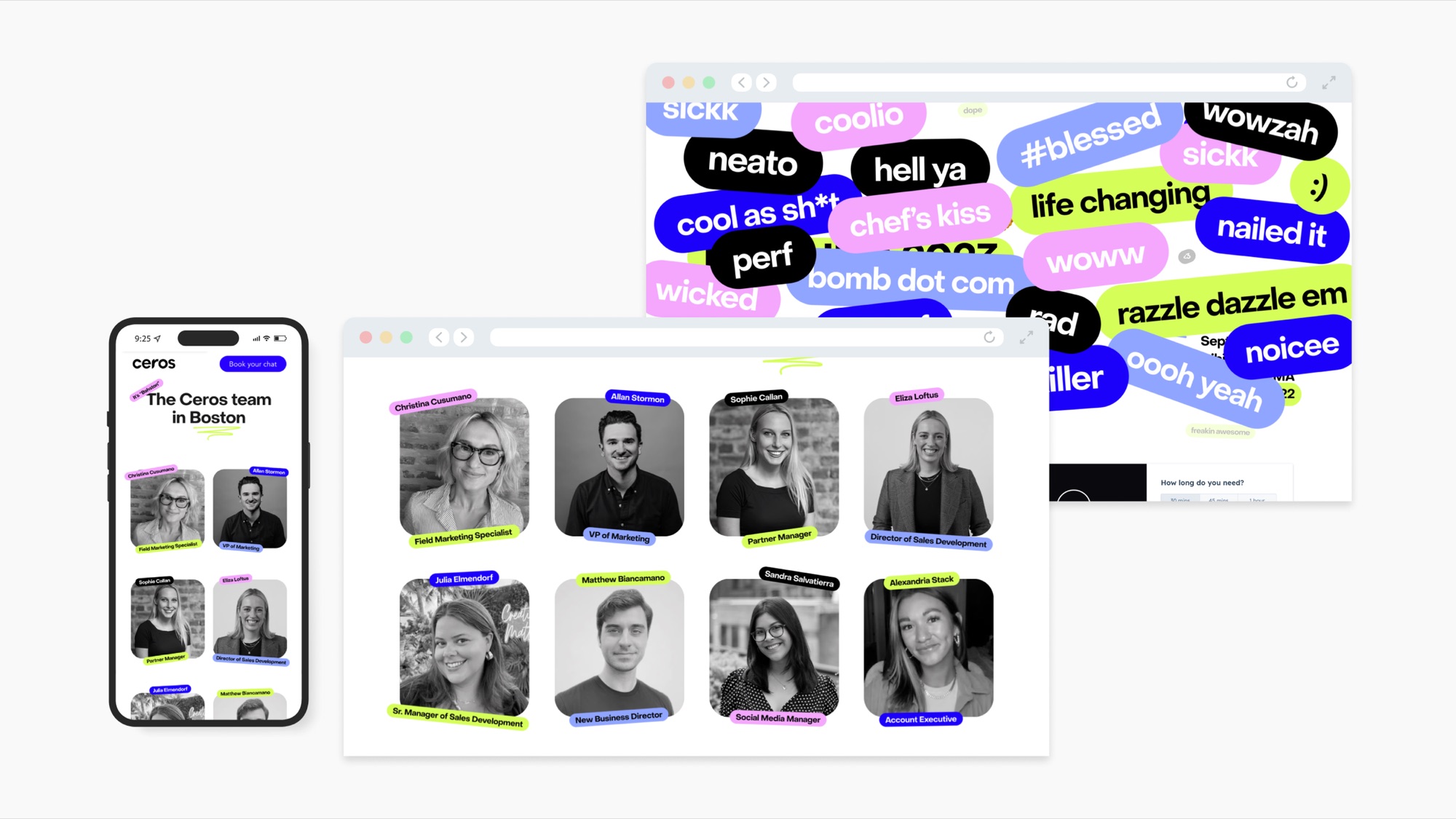
Event page: The Ceros team in Boston, with each team member tagged in campaign pills, on desktop and mobile, over a wall of reactions like neato, chef's kiss and nailed it

Meet the team before the booth

An event page introduced the Ceros team in Boston, each person tagged in the campaign’s pills, so visitors could book a chat before they arrived.

A sandbox, not a sales pitch

CeroSpace, the booth’s touchscreen, let visitors play instead of being pitched. Styled as a retro desktop with a sense of humor, it explained what Ceros is, what it makes, and why interactive content beats a 100-page PDF.

Open the report and it “can’t be loaded because it’s too boring.” The Start menu opens real examples of interactive content, and a Minesweeper game warns: do not click on static content. Every tap made the case for engagement over pages.
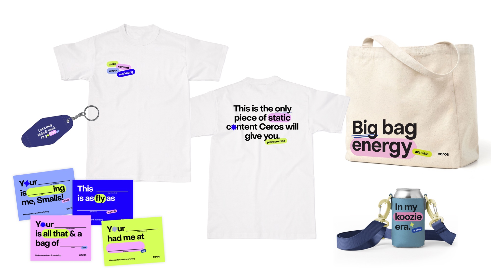
Campaign merch: a Big bag energy tote, a T-shirt reading This is the only piece of static content Ceros will give you, a koozie reading In my koozie era, a keychain and fill-in-the-blank stickers

Merch with a punchline

A “Big bag energy” tote, a T-shirt that calls itself “the only piece of static content Ceros will give you,” a koozie, a keychain, and fill-in-the-blank stickers drew people to the booth and kept the joke going after the show.

At the booth

Totes on shoulders, brochures that read “Hell yeah, another brochure!”, and the touchscreen in play at INBOUND.
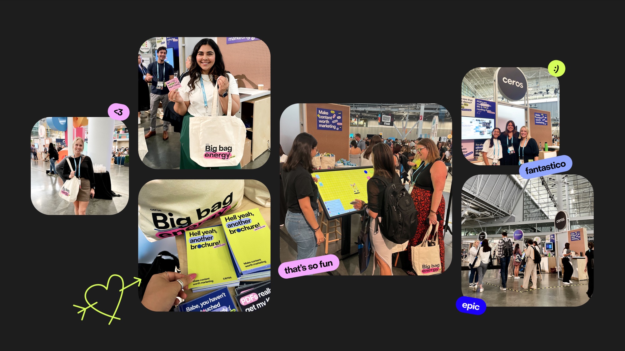
Photos from the Ceros booth at INBOUND: visitors with Big bag energy totes, campaign brochures, people playing the touchscreen, and the Ceros team at the booth

A campaign people stopped for

Compared with the previous year’s campaign, engagement and subscriptions both rose, and the Big bag energy merch kept the booth busy. The campaign’s success prompted the executive team to commission a full Ceros rebrand, aligning the brand with the company’s transformation and upcoming product launches.

1.75×
engagement vs. last year’s campaign
1.5×
subscription rate vs. last year