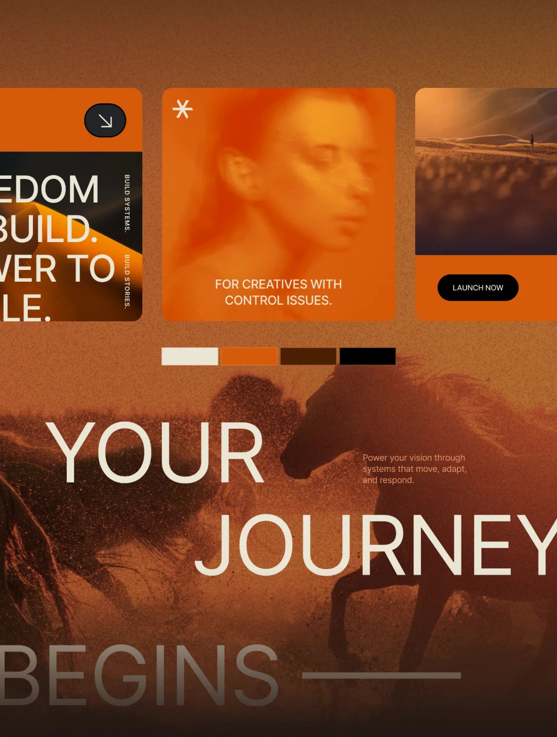
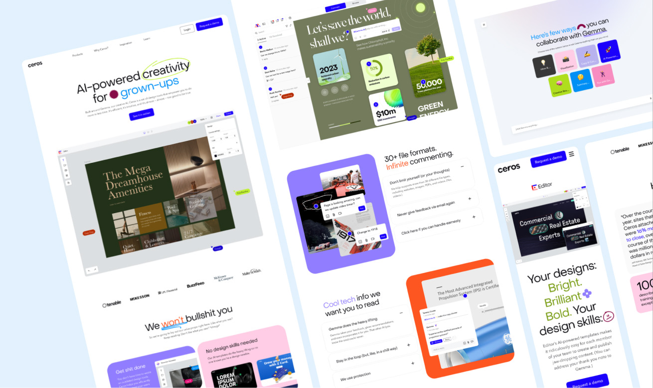
From playful to precise
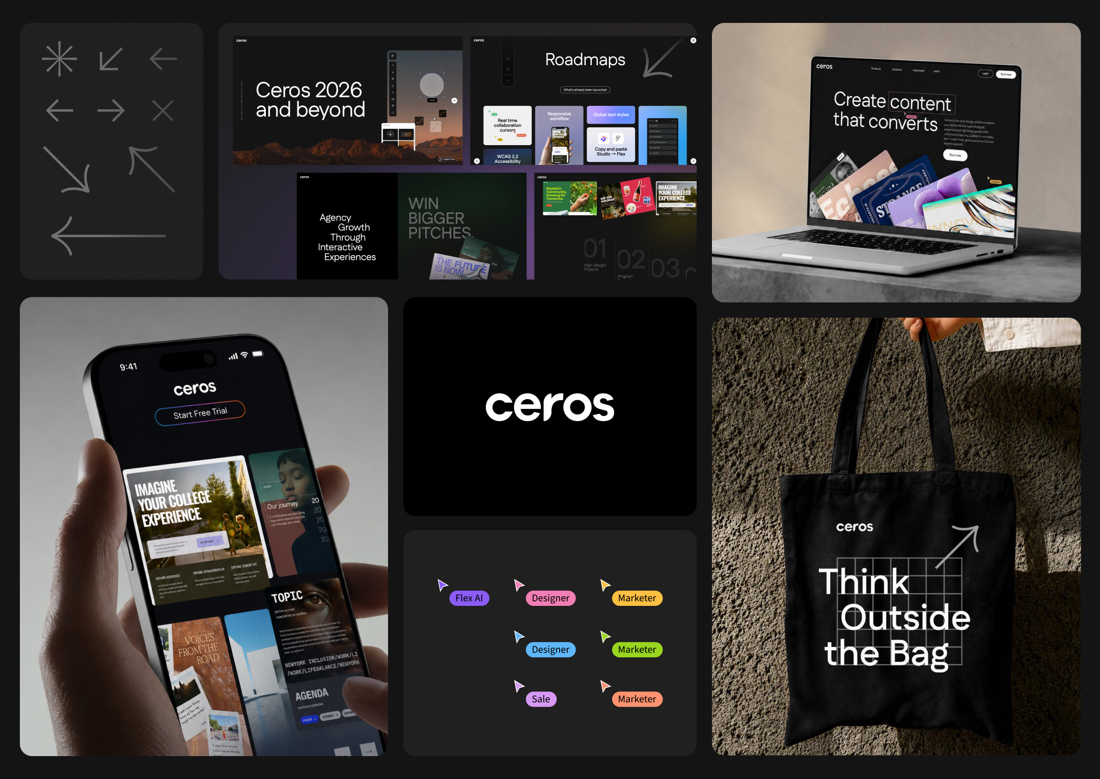
The old identity welcomed everyone. The new one speaks to pro designers: a monochrome foundation, vector grid textures, and precise type. Same company, opposite brief.
Built together in one shared file
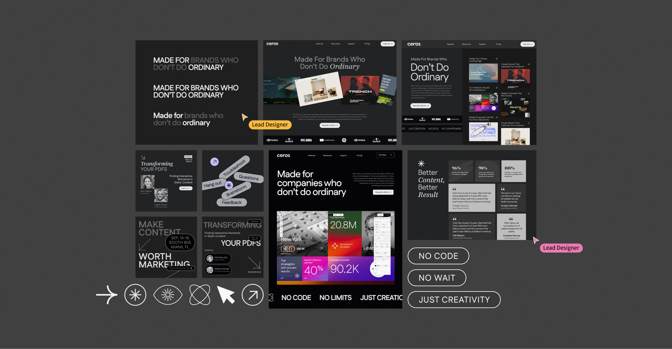
I co-led the visual exploration with a second Lead Designer in one shared Figma file, then we split the web work, each owning the homepage or the product pages.

A quiet canvas with functional color
A monochrome base keeps the focus on customer work. Color appears only where it means something: FlexAI, Flex collaboration, and live cursors.
Typographic expression
Set in Fustat, the type leans editorial, using scale contrast between uppercase and sentence case for drama.
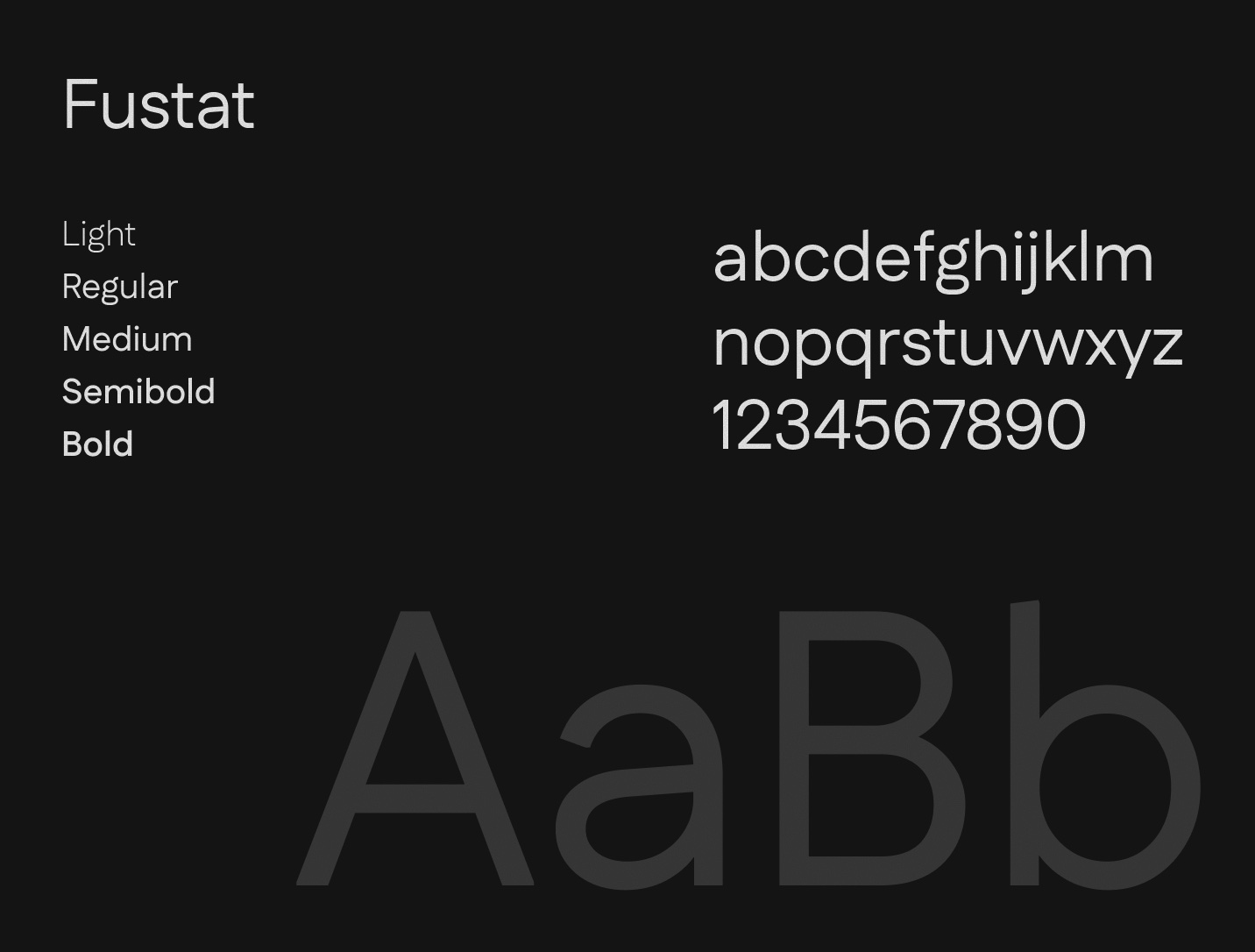

Rules that keep the system sharp
The guidelines lock down type, color, spacing, radius, and icons, and keep hand-drawn marks to social and education posts so ceros.com stays minimal.
Rolled out everywhere at once
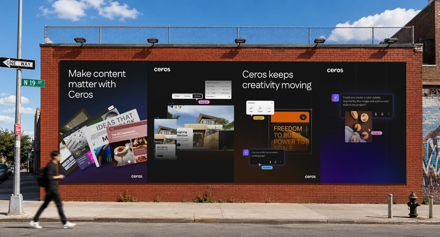
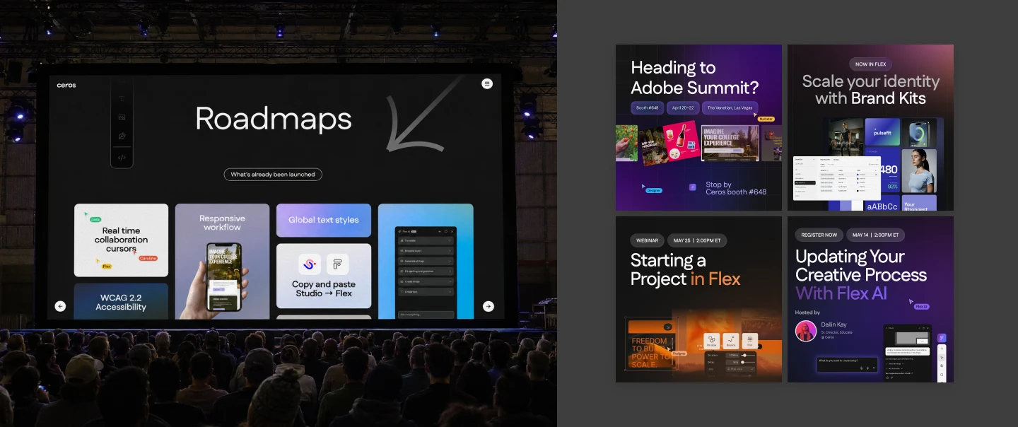
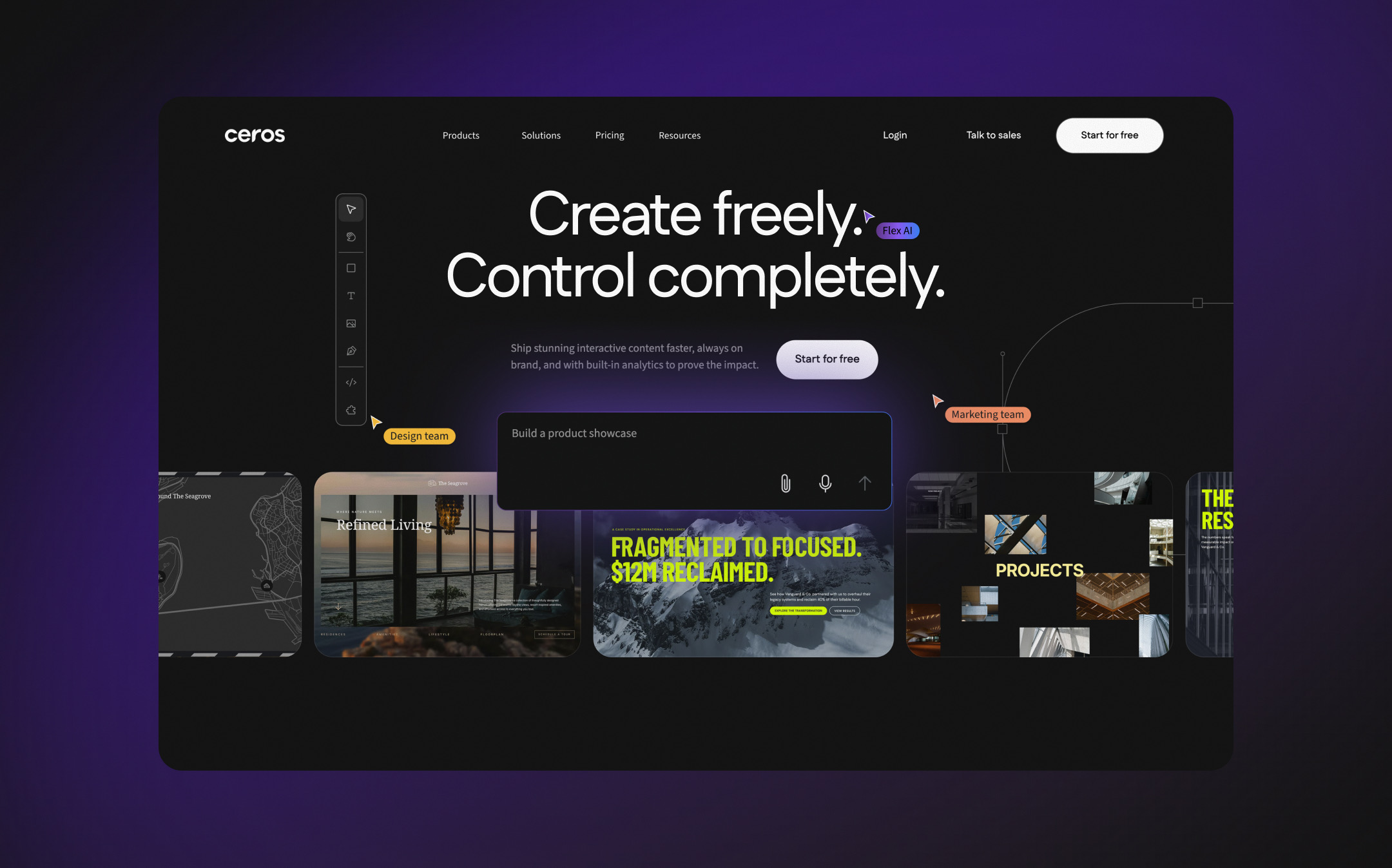
Events, social, and the new ceros.com launched together, so the brand changed in one clear step.
A brand that looks like its audience
The rebrand elevated Ceros from a broad marketing tool to a design platform for creative professionals. One gallery-grade system now carries the master brand, Flex, and FlexAI across the website, social, email, motion, webinars, events, and out-of-home, giving customer work the spotlight and a ready launchpad for Flex and FlexAI.
- 3
- brands on one system: Ceros, Flex, FlexAI
- 7
- touchpoints: web, social, email, motion, webinars, events, out-of-home
- 1
- shared Figma file the whole identity was built and tested in