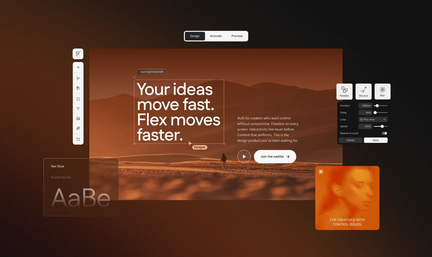
Ceros Flex Launch

Launching a modern interactive-design platform through a visual world that made new technology feel human, warm, and full of possibility.

A new product needed a launch that felt different

Ceros Studio’s aging foundation no longer matched how designers expected to work. It did not support responsive design, and it lacked newer tools like an AI assistant and modern scroll and parallax effects. Flex introduced all of them. I owned the visual direction for its launch, from mood boards and the key visual through the landing page, email, and video storyboards.

A warm world, built in the product

Pair a warm, exploratory campaign story with a launch experience built in Flex itself. The story positions Flex as a creative partner, and the build proves its responsive capabilities in real production. The launch would not only describe creative possibility; it would demonstrate it.

Mood boards before layouts

I started with three mood-board routes rather than page layouts, so the team could agree on a feeling before production narrowed the options.

The abstract routes created energy but no story. The Mars route treated Flex as unexplored creative territory: expansive, mysterious, and optimistic. Orange warmed the Ceros black. The creative director approved it because it gave every touchpoint a shared world to grow from.

Production as product QA

The launch page was built in Flex, so the campaign doubled as a real responsive stress test. As I worked through layouts and breakpoints, I documented issues for Engineering, such as a carousel that locked grouped layers from editing and trigger logic reversed from Studio, giving the product team concrete fixes before release.

Outcome

One campaign idea carried across the key visual, landing page, email, gallery templates, and launch films. In the six months after launch, Sales Operations and Marketing Analytics reported a shorter sales cycle, higher ideal-customer conversion, and twice as many accounts.

Company

Ceros

Role

Lead visual and experience designer

Timeline

About 2 months

Team

Creative director, Head of Design, product manager, motion designer, marketing, Engineering

What I did
  • Visual direction
  • Mood boards
  • Key visual
  • Landing page
  • Email design
  • Gallery templates
  • Video storyboards
  • Product QA

Warm where the category runs cold

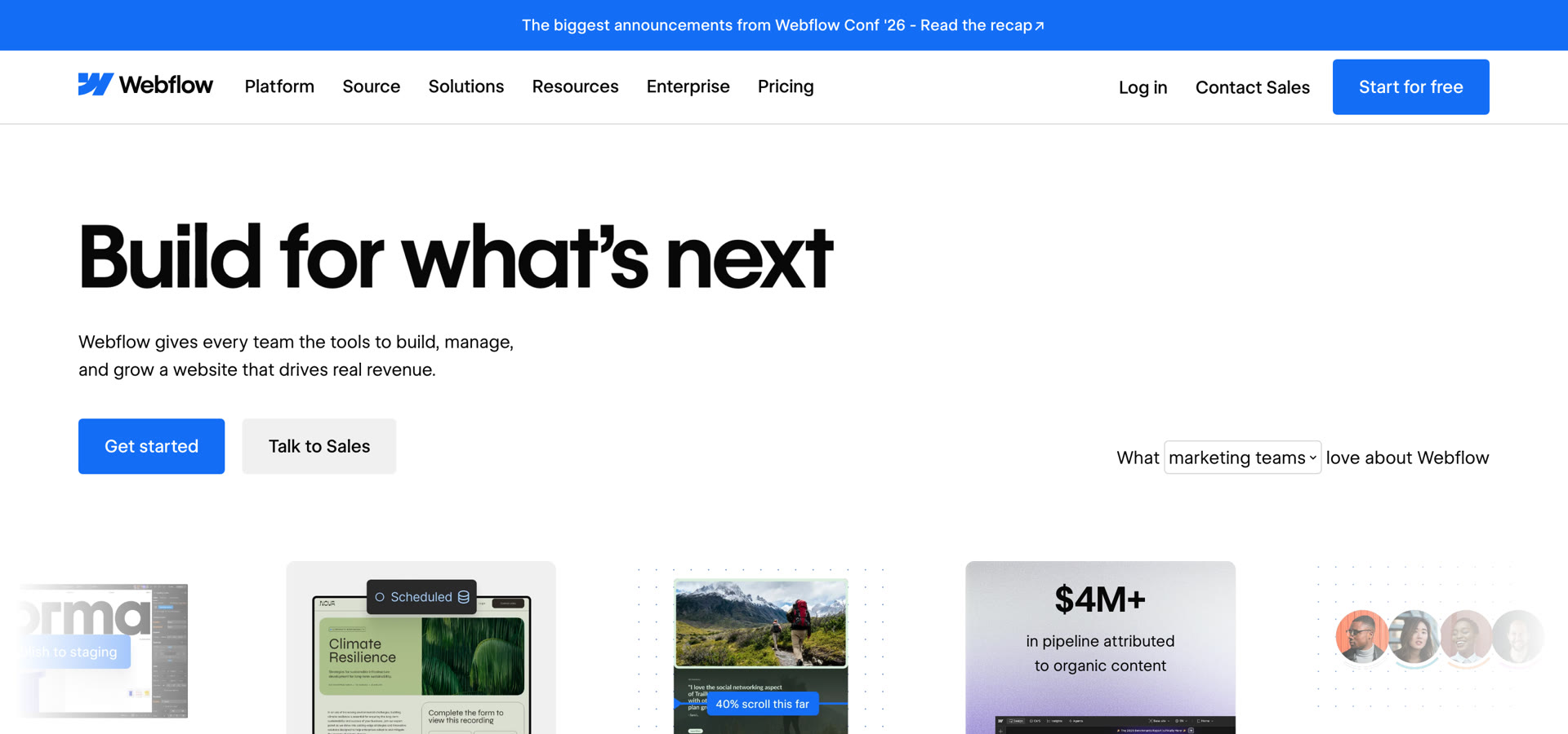
Framer, Webflow and other AI design tools lean on black, electric blue and a technical tone. Flex needed to signal innovation without feeling like another cold tech brand, so it went the other way: desert light, orange and a human story.
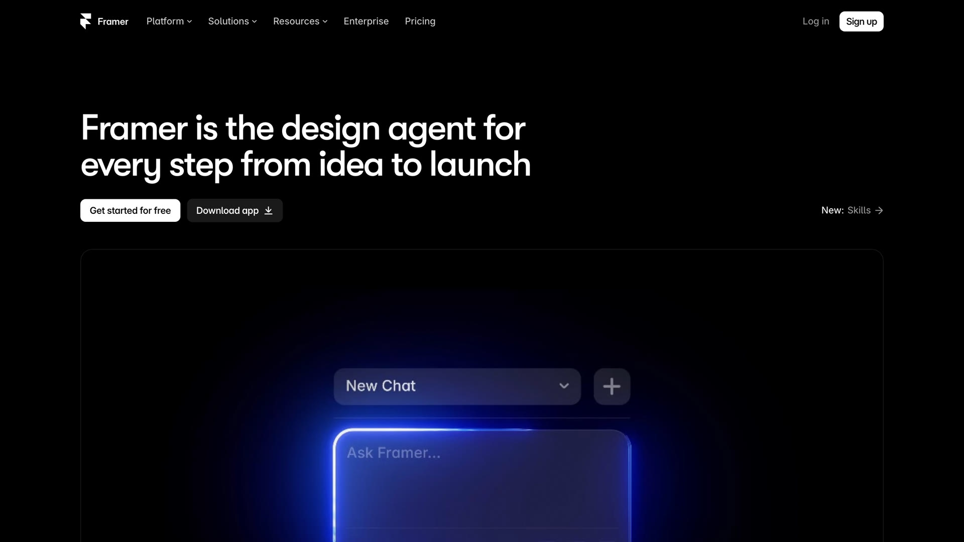
framer.com
Framer homepage: black background with an electric blue glowing AI prompt box
webflow.com
Webflow homepage: white and bright blue, with a technical product-led layout
Flex launch page: warm desert light and orange, Your ideas move fast. Flex moves faster.

Mars as a metaphor for creative possibility

The chosen route: asteroids, desert light, and gold, on the Ceros black.
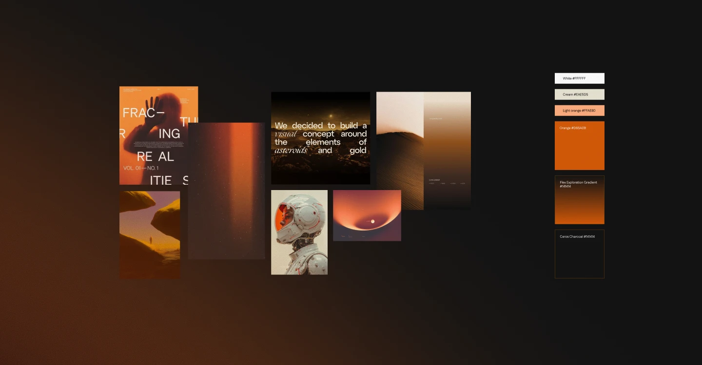
Mars mood board: orange and gold desert imagery, an astronaut helmet, editorial type, and the palette from white and cream to orange, the Flex exploration gradient, and Ceros Charcoal

Warm color, open frontiers

Black kept continuity with Ceros; orange stood for warmth and humanity.

Beyond color, every scene was built around exploration: open desert, the wild American West, and Mars-like landscapes with a hint of outer space. Together they cast Flex as new territory, a place where designers could discover what they were capable of making.
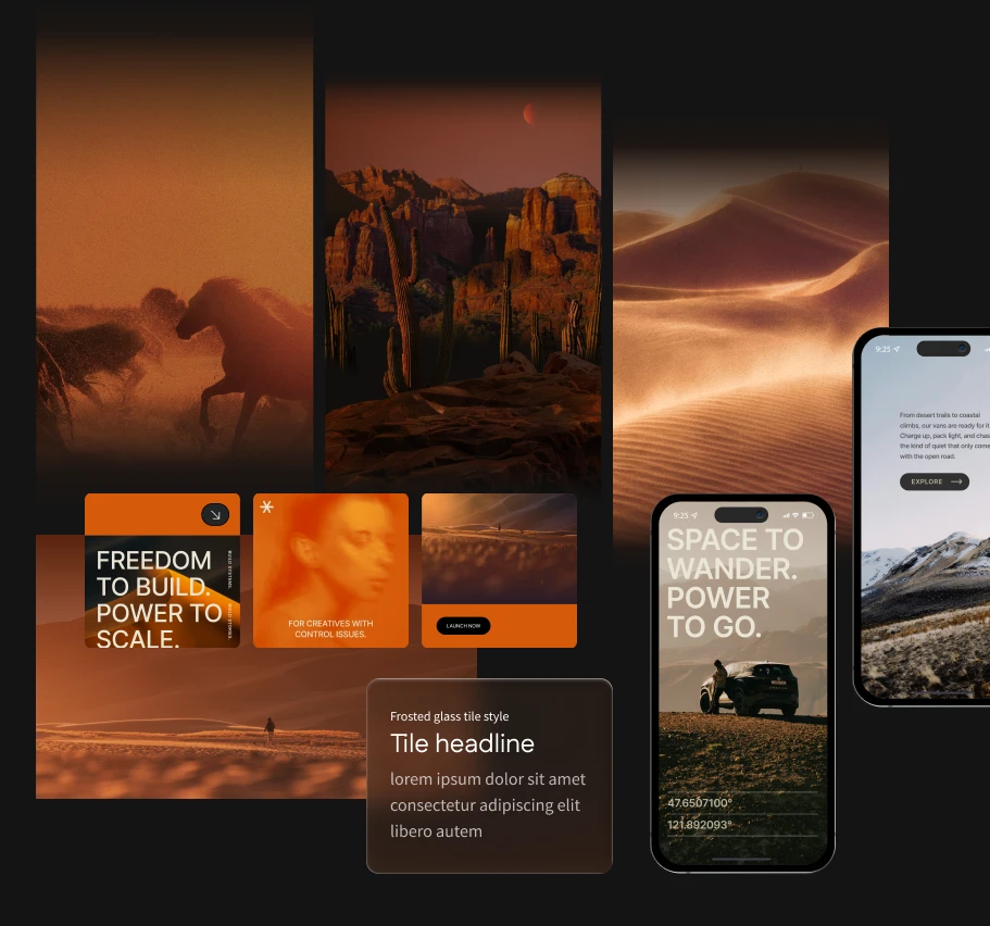
Campaign imagery: desert horses, canyons and dunes in orange light, campaign tiles, a frosted glass tile style, and mobile screens
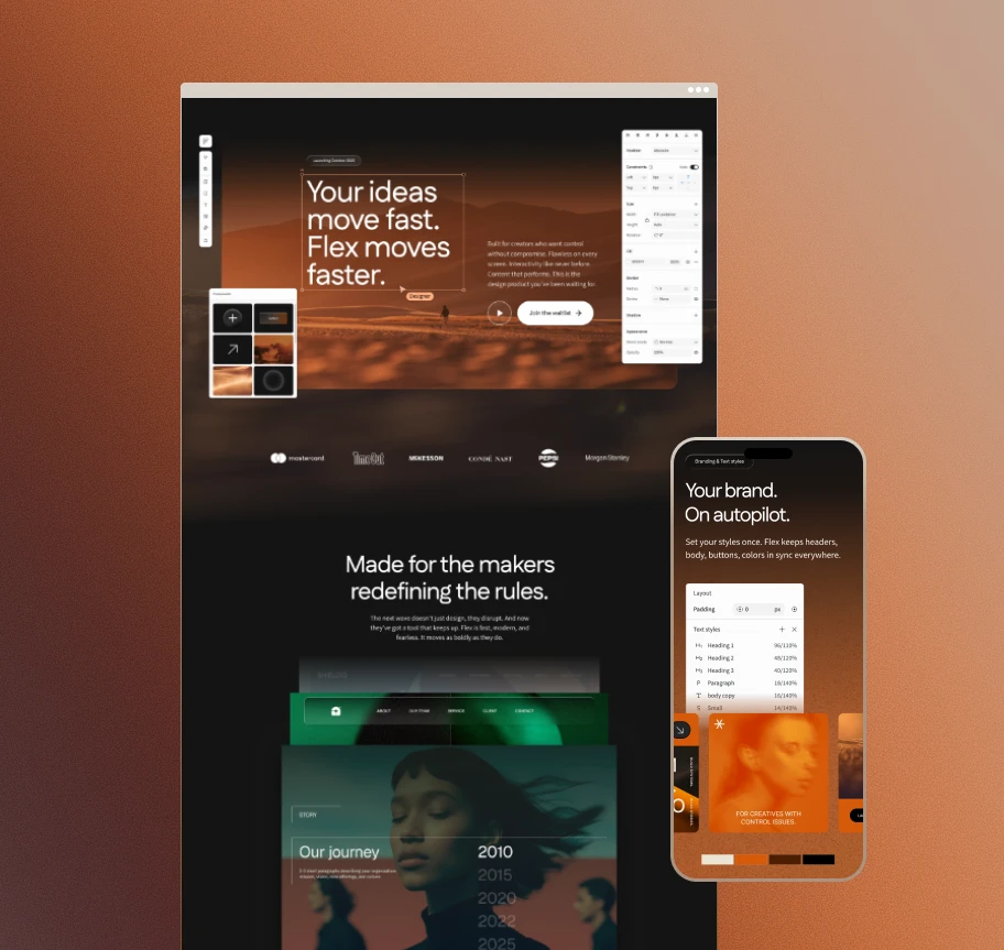
Flex launch landing page in a browser and on a phone, with editor panels for components and text styles

Built in Flex itself

The landing page was a real responsive stress test, and the bugs I logged went to Engineering before launch.
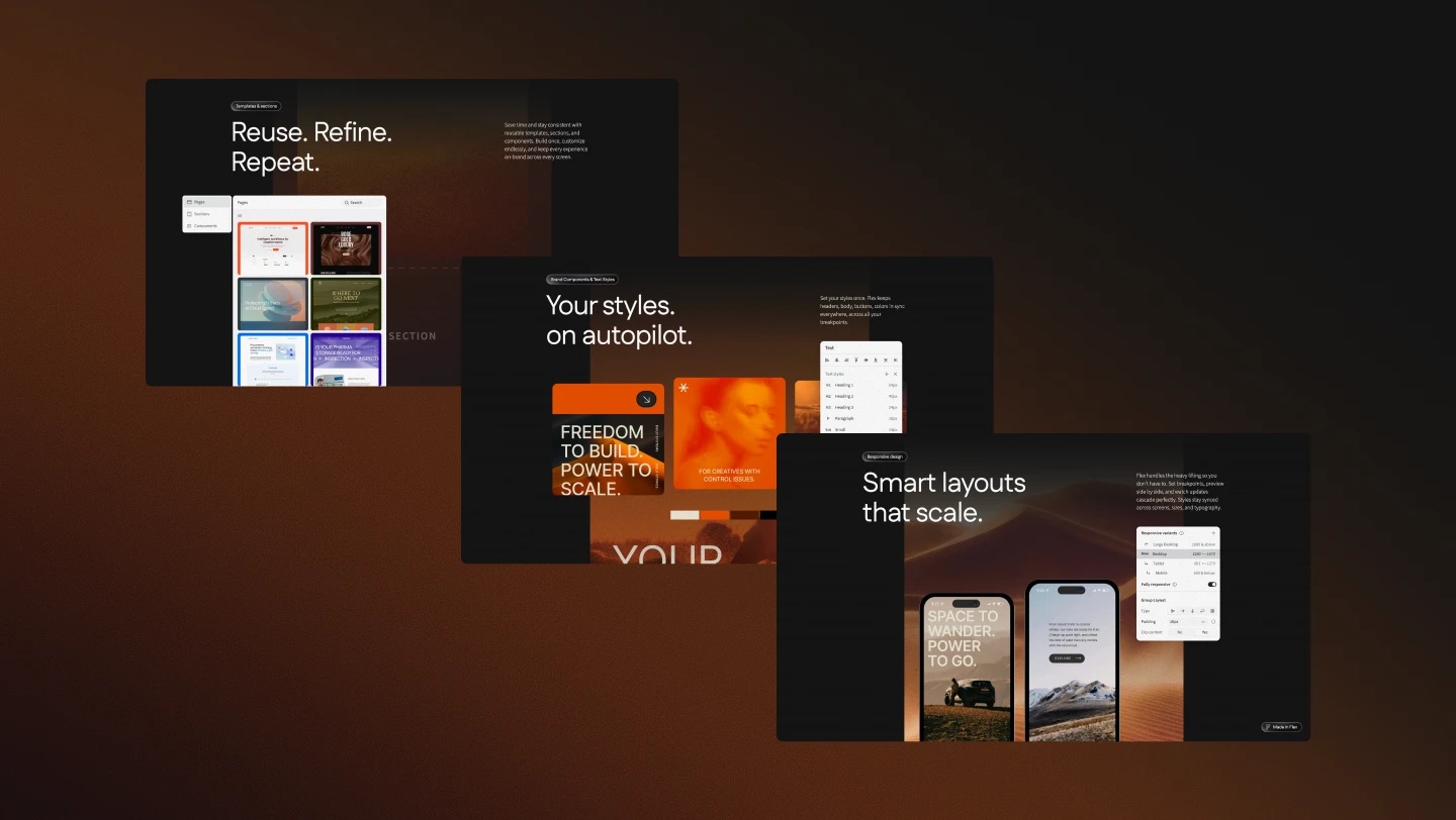
Three Flex launch pages on warm brown: Reuse. Refine. Repeat. with templates and sections; Your styles. on autopilot. with brand text styles; Smart layouts that scale. with responsive phones

One idea across every channel

Shared imagery, palette, and type kept social, web, and launch films recognizable without repeating one layout.
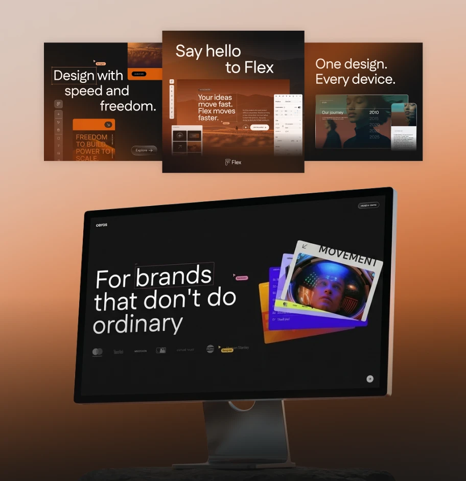
Launch social posts and the Ceros homepage on a monitor: For brands that don't do ordinary
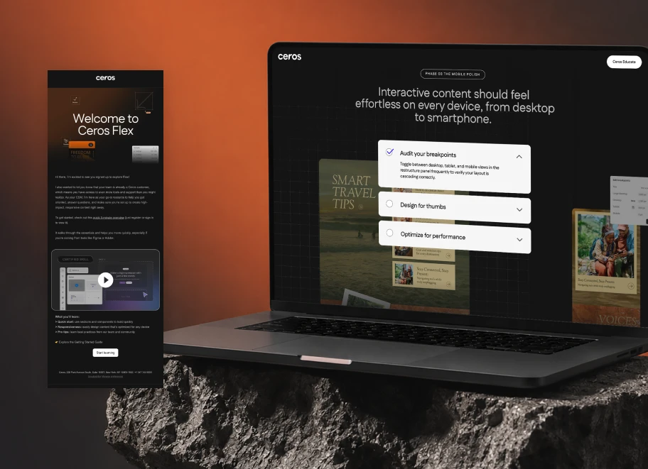
Welcome to Ceros Flex email beside a Ceros Educate page on a laptop

An email series that teaches

I designed the launch and onboarding email series in the same visual system. Several emails carried a first-build checklist: the steps Ceros recommends to anyone designing their first interactive experience in Flex, so new users learned the product as they met the brand.

Templates to start from

Gallery templates showed new users what Flex could make, from a client snapshot to a landing page.

A launch system tied to business movement

Comparing the six months before launch with the six months after, Sales Operations and Marketing Analytics reported these results. They reflect the broader go-to-market effort, including product, sales, and marketing, not the campaign alone.

18044
sales-cycle days
3%7%
ideal-customer conversion
2×
accounts in six months