
From spreadsheets to a story
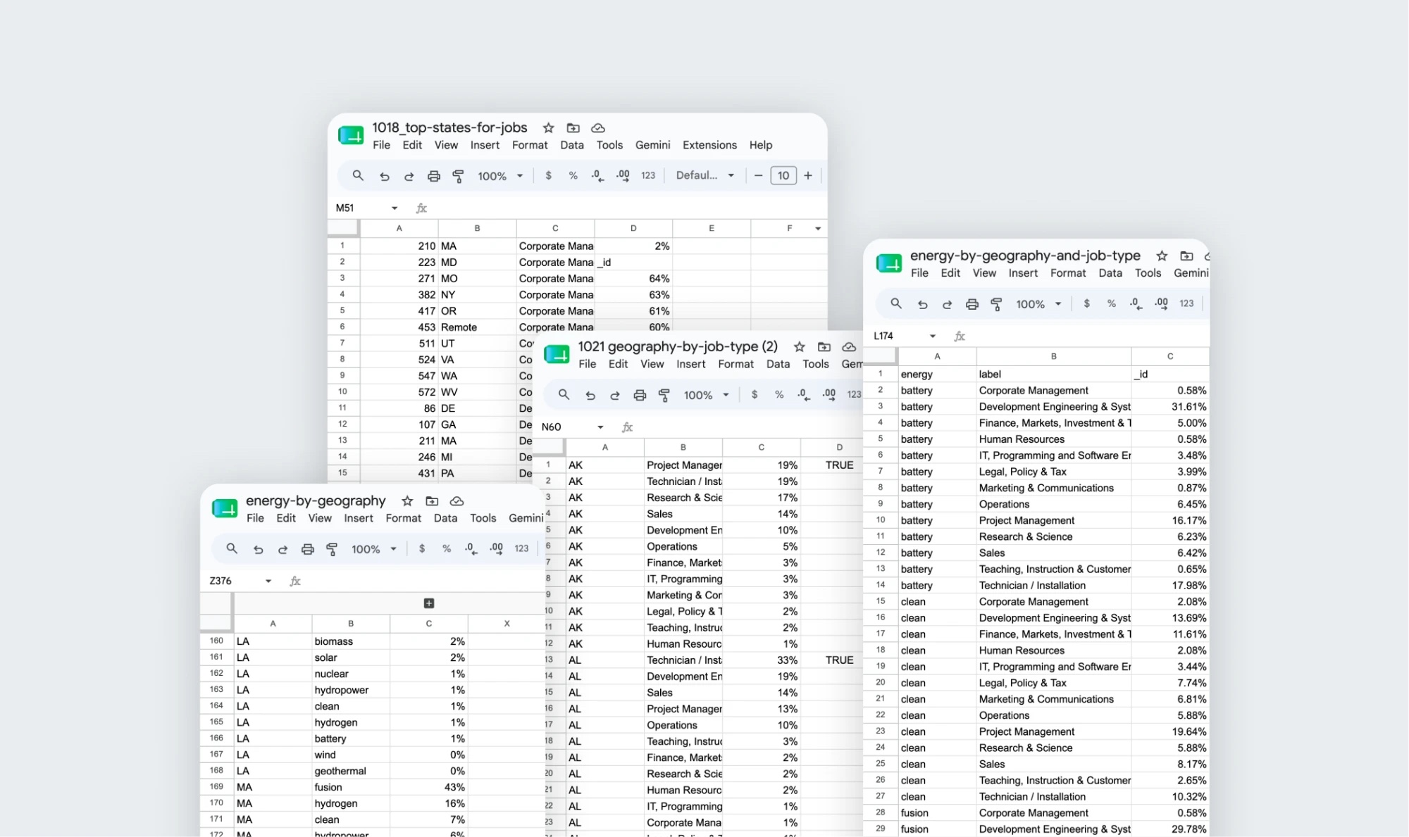
Twenty-three spreadsheets of raw job data, mapped into a wireframe, then built into one navigable, responsive guide.
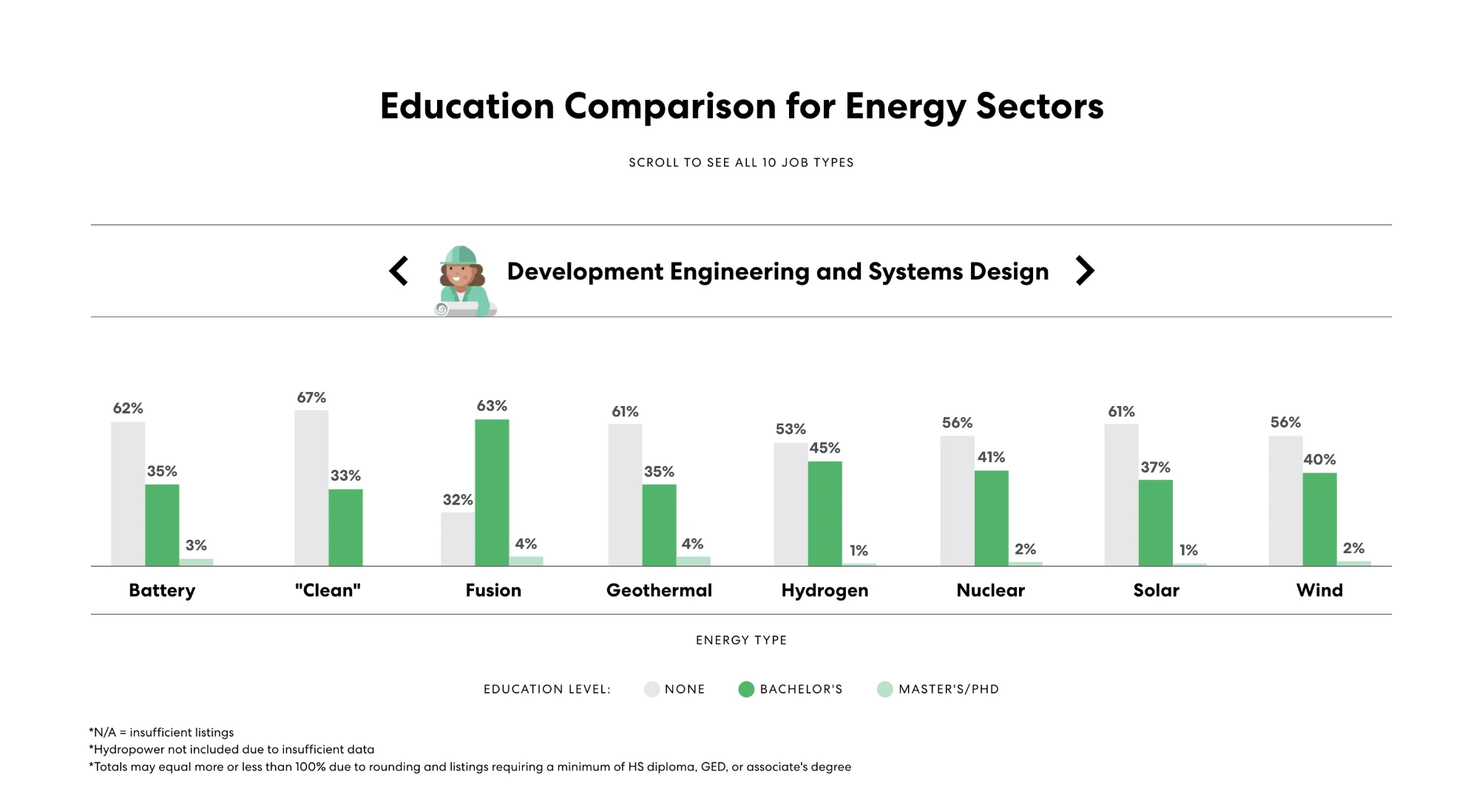
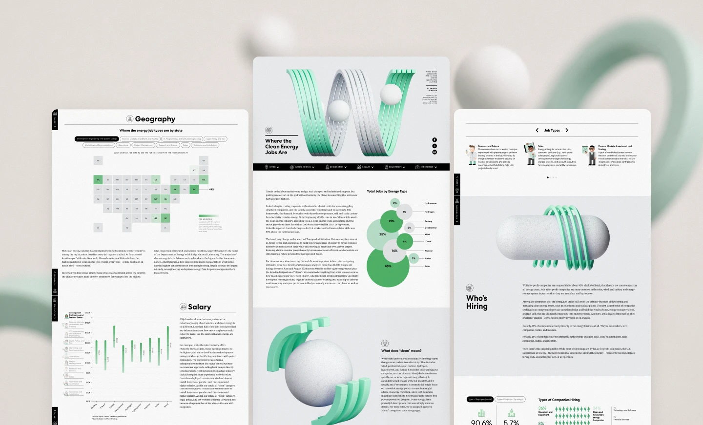
Structure before styling
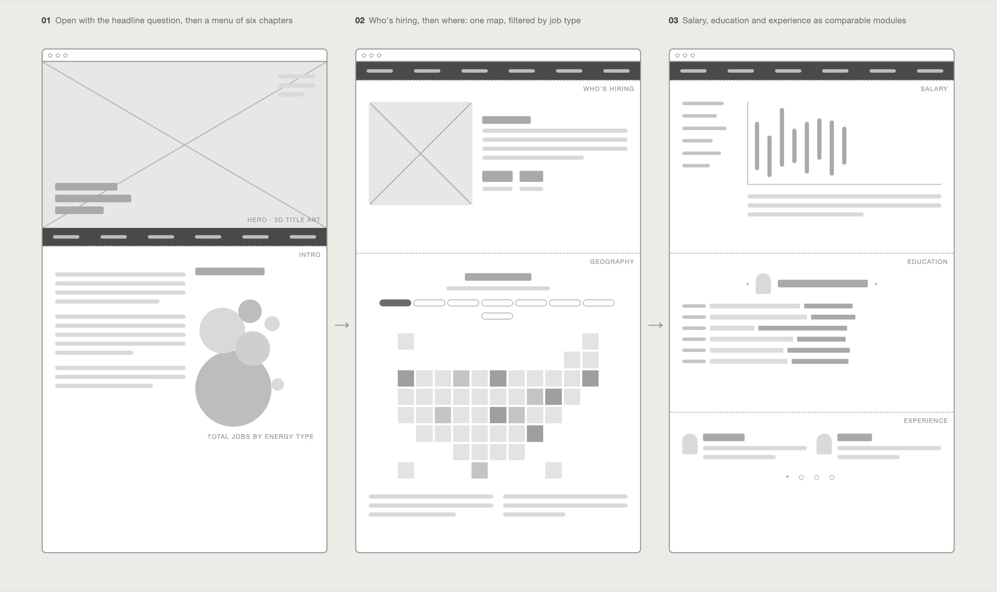
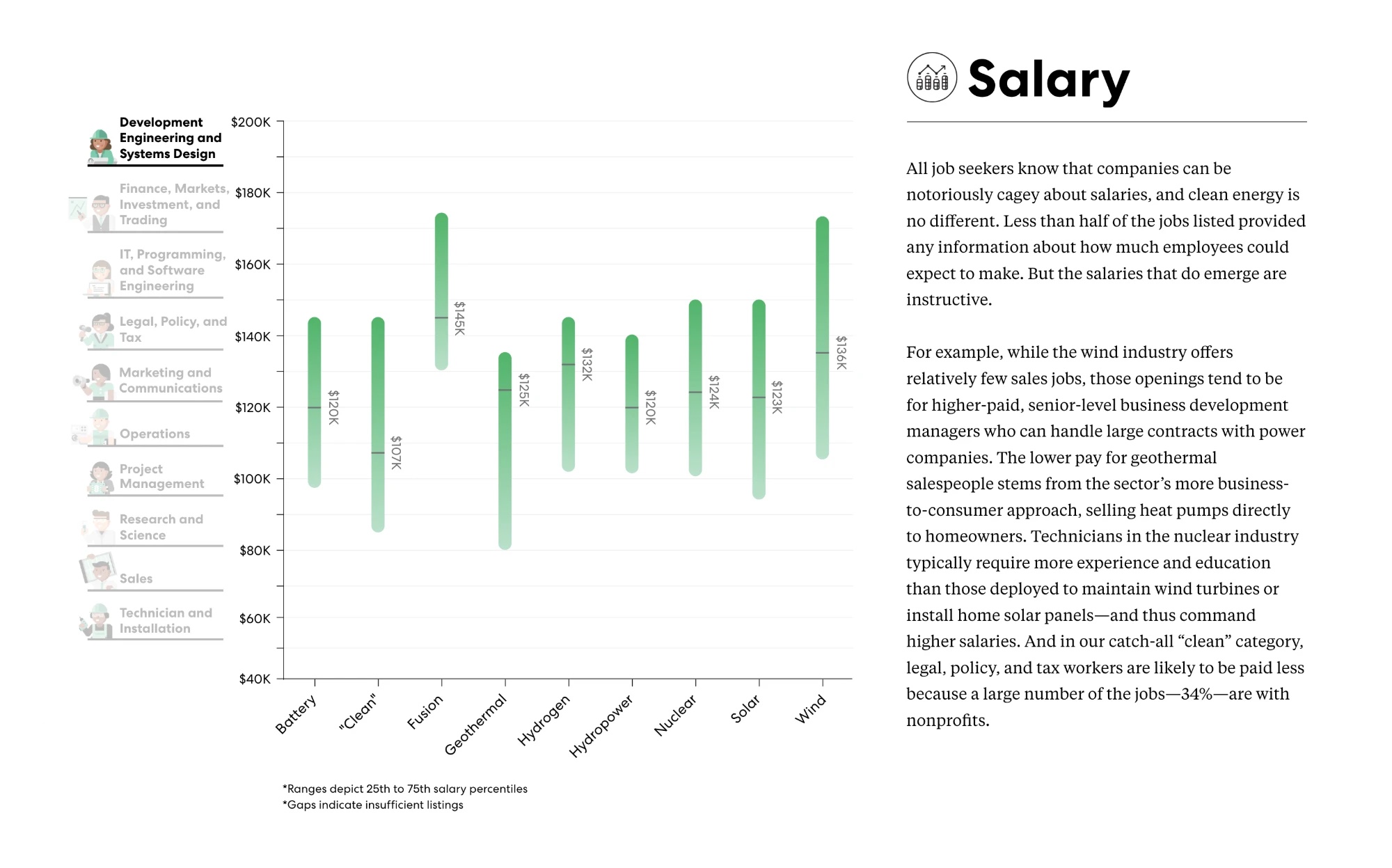
The data was sorted into clear themes first; each theme then got its own chart and interaction.
Answer the big question first
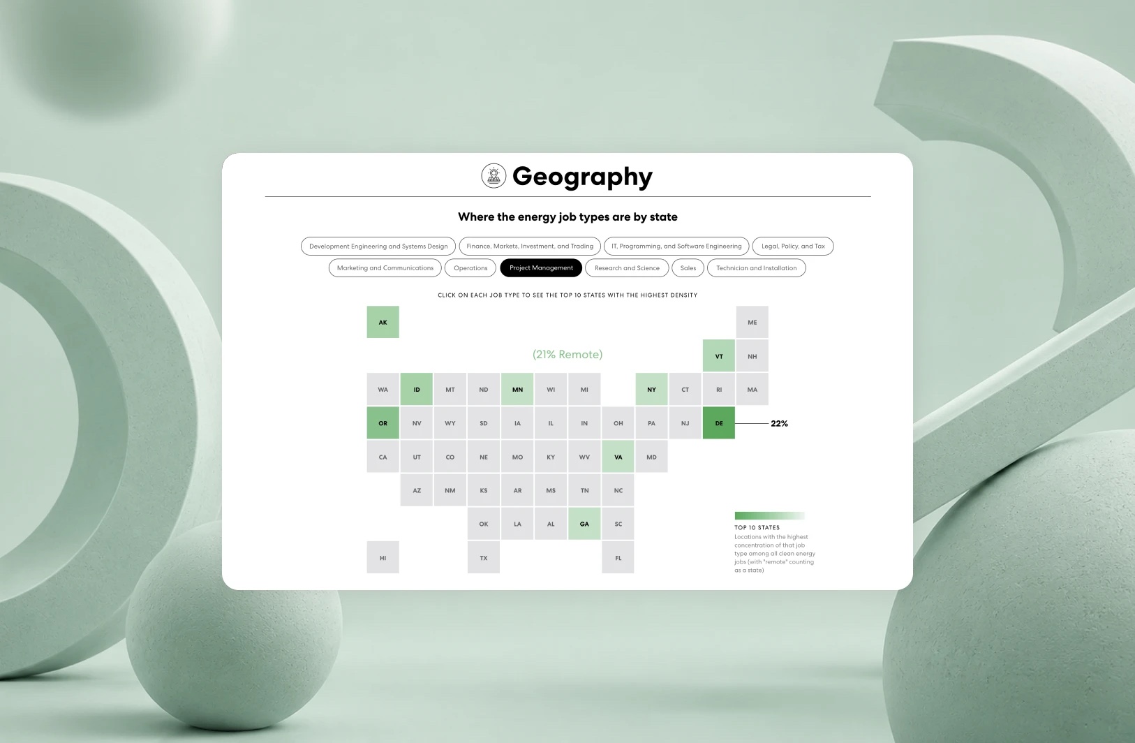
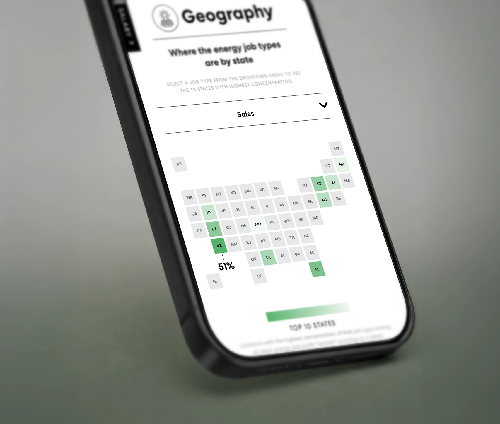
Readers start with where the jobs are, then click through job types to see the top states for each.
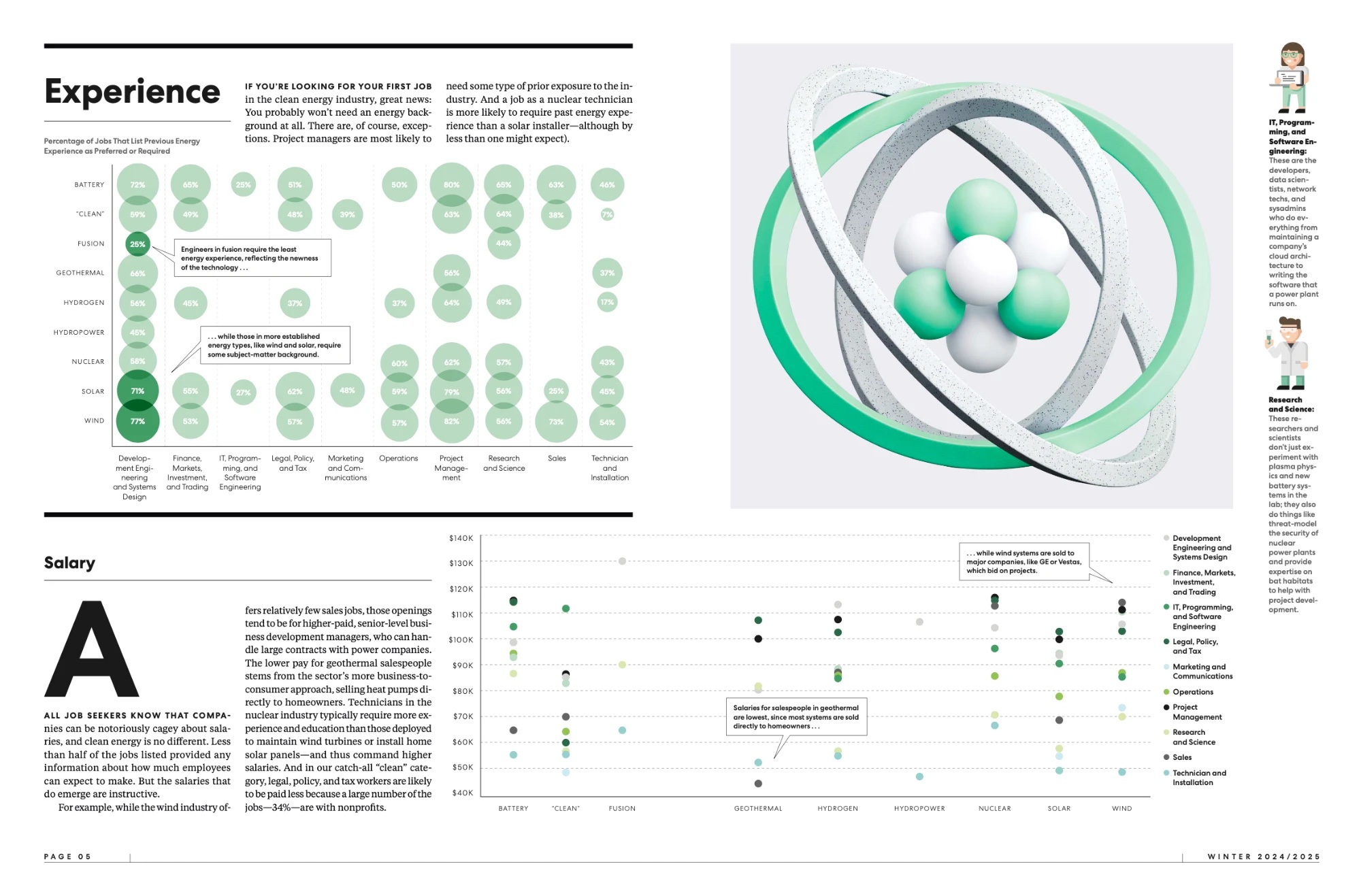
Print vs. interactive
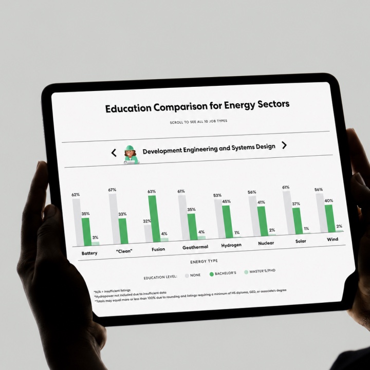
The report also ran in print. A print designer laid out the pages while I led the digital version, and we compared every chart side by side. A printed spread can hold dense tables, but that much information on one screen is hard to read. So rather than squeeze it all in, the interactive version uses filters, step-by-step reveals and mobile-first layouts, letting readers explore the data around their own questions.
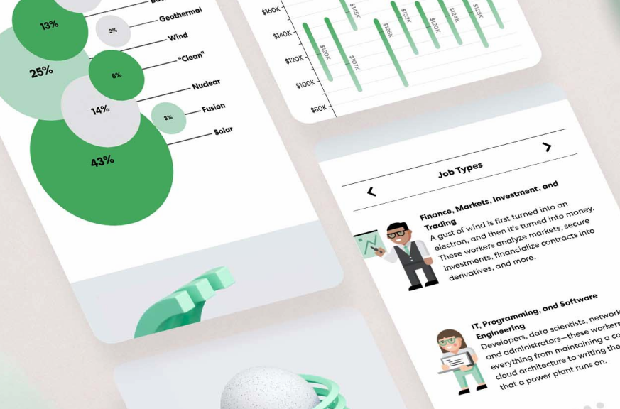
Built for every screen
Each chart was redesigned for mobile so detailed comparisons stay readable, not just smaller.


Dense research became a navigable public resource
The finished feature turned nationwide employment research into an accessible visual story, helping readers absorb it quickly or jump straight to what mattered to them.
- 12M+
- readers reached
- 26K+
- job postings synthesized
- 10+
- academic and industry sources cited or shared it