
Vibrant Physical Therapy logo in white over a soft sage leaf texture

Vibrant Physical Therapy

Restoring systemic balance: a brand for a physical therapy practice that treats the whole body as one connected system.

Gentle care for sensitive bodies

Traditional “no pain, no gain” rehab often leaves delicate and hypermobile bodies worse off. Vibrant Physical Therapy, a small practice in Kirkland, Washington, takes a gentler path. I led its brand strategy, identity, and art direction, from the clinic to the website and social.

Listening first

I started with interviews. I asked Dr. Chen how her hands-on work differs from traditional physical therapy, who comes to see her, and why they stay.

Lighter hands, a different kind of patient

Her treatment is gentle and release-first rather than forceful. Most of her clients are women, many of them coming to her for menstrual pain and chronic tension that harder therapy only made worse.

From the head down

She works through the fascia, usually starting at the head and reading the whole body from there. That one idea shaped the logo, and the soft, soothing palette followed from the people she cares for.

Client

Vibrant Physical Therapy, Kirkland, WA

Industry

Healthcare, high-end wellness

Timeline

Sep – Nov 2023

What I did
  • Brand strategy
  • Visual identity
  • Art direction
  • Spatial concepts
  • Social & web strategy

Client discovery and strategic insights

Dr. Chen knew her craft, not her brand. Our interviews surfaced what sets her apart: light, release-first treatment, fascial work that starts at the head, and clients who are mostly women, many treating menstrual pain.

A runner mid-stride in soft sage tones

Creative strategy and mood board

A strong physical structure balanced with smooth, graceful movement: earthy, natural tones with structured and organic lines that stand for fascia and movement pathways.
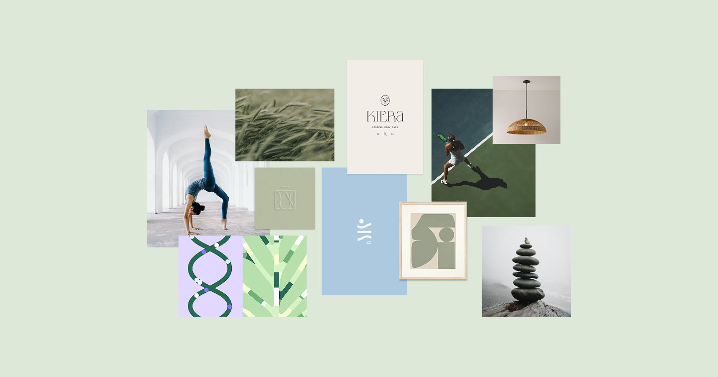
Mood board on sage: a yoga backbend under white arches, wheat grass, an embossed mark, a tennis court from above, a rattan pendant lamp, abstract sage shapes and stacked stones
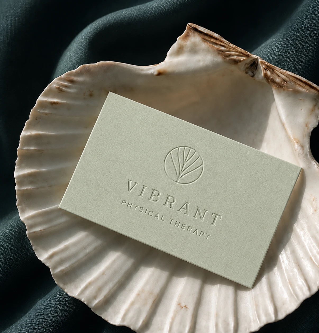
Sage business card with the blind-embossed Vibrant Physical Therapy logo, resting in a white scallop shell on deep teal linen

The logo mark and its symbolism

Dr. Chen’s fascial work usually starts at the head and moves through the whole body. I drew that as a plant stem: one line rising from the crown, branching outward the way fascia spreads through the body. The circle holds it all in balance.

Soft sage, deep teal, warm cream

For an audience of mostly women seeking gentle care, I chose soft, soothing tones. Soft Sage and Warm Cream calm; Slate Dark Teal and Teal Green add quiet trust on signage and print; pastel accents bring warmth.
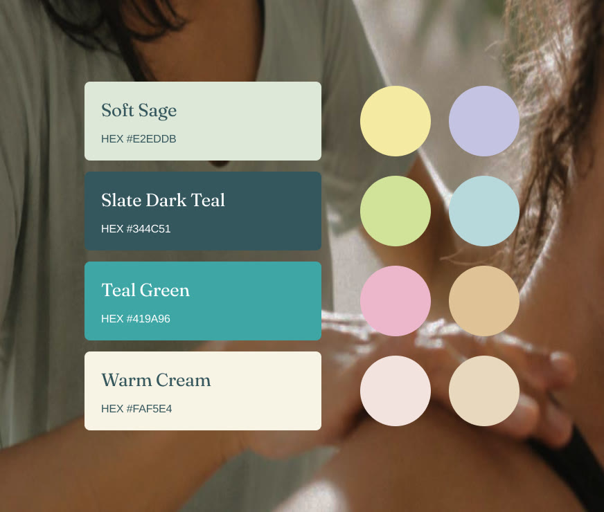

Brand palette: Soft Sage #E2EDDB, Slate Dark Teal #344C51, Teal Green #419A96, Warm Cream #FAF5E4, with soft yellow, lavender, lime, sky, pink, sand and blush accents
Pattern: soft organic lines in yellow, lavender, sky, lime and blush on sage
Pattern: a fine square grid on warm cream

Brand patterns and visual language

Smooth organic lines follow fascial pathways and movement; a clean square grid stands for structure and alignment. Soft gradients drift across both, like tension releasing.
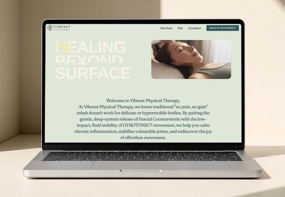
Vibrant website on a laptop
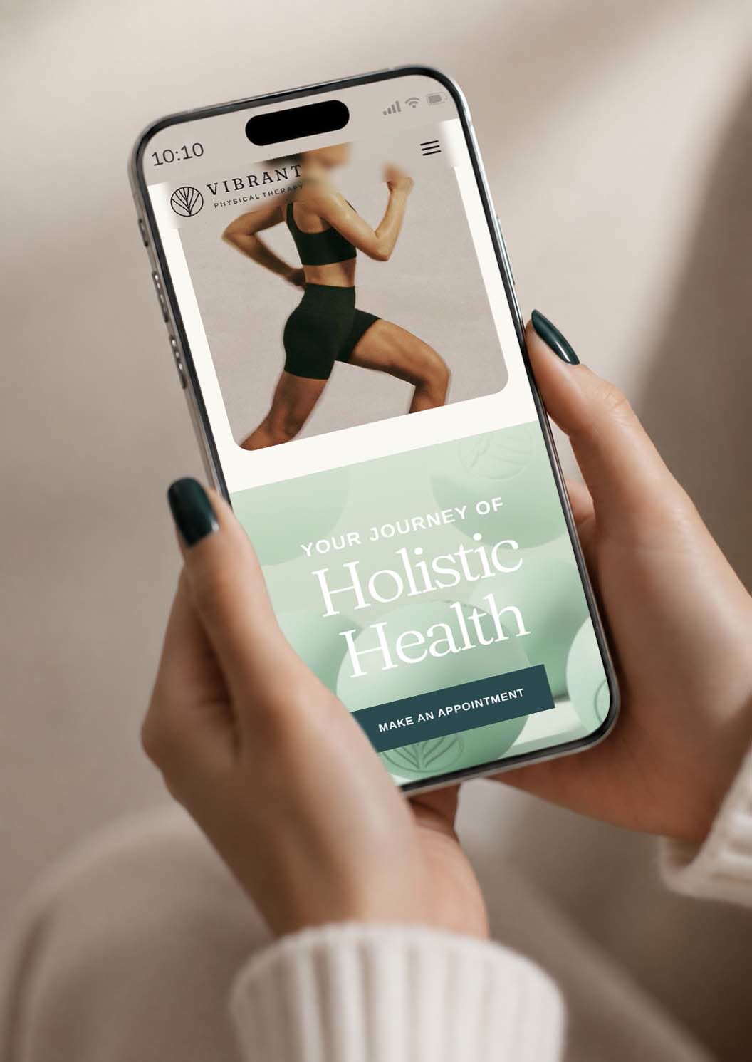
Mobile site in hand: Your journey of holistic health, with a Make an appointment button
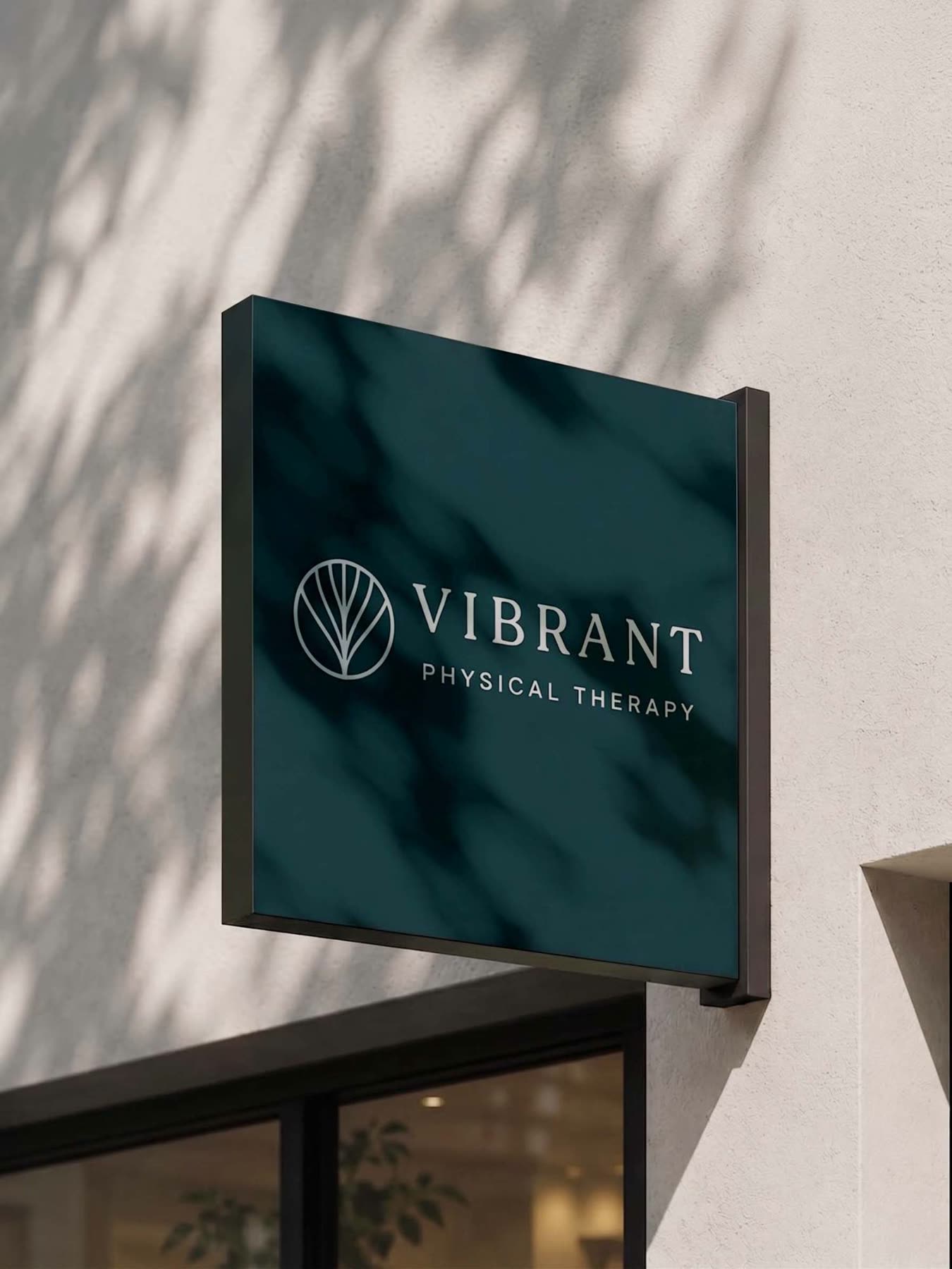
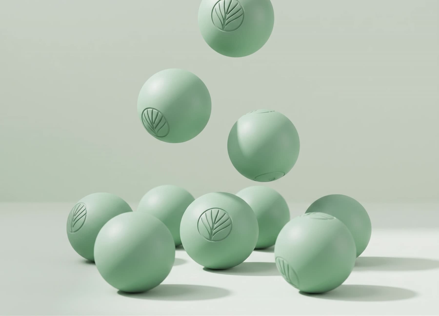
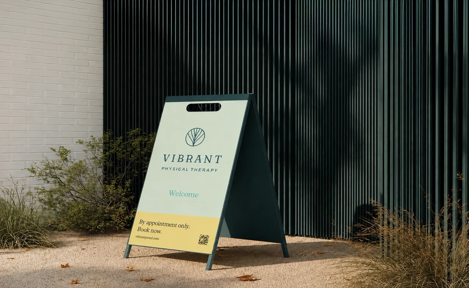
Deep teal hanging sign with the Vibrant Physical Therapy logo, dappled with leaf shadows Sage massage balls embossed with the leaf mark A-frame sidewalk sign in sage and yellow: Welcome, by appointment only, book now

Social that speaks softly

Neighborhood welcomes, patient stories, and gentle education share one calm grid, so the feed feels like a visit to the clinic.
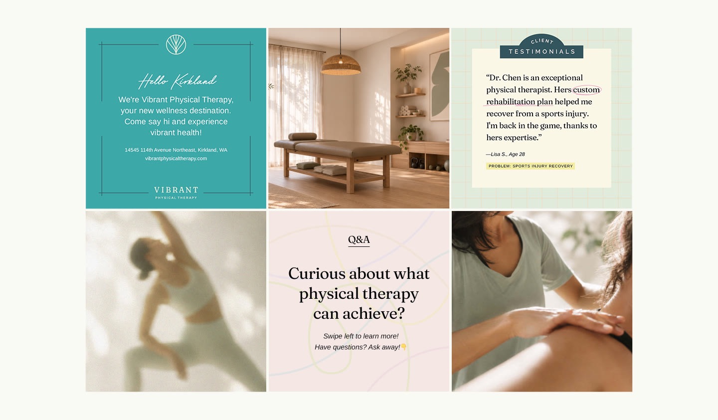
Social posts: Hello Kirkland, the treatment room, a client testimonial, a stretching figure, a Q&A card and a shoulder treatment

A practice that looks like its care

Dr. Chen now has a complete brand that explains her care before she says a word. I built it end to end: the brand identity, color, type, and visual style; the clinic’s interior; visual elements; social layouts and templates; the website; print collateral; and branded massage products. Together they give her patients one calm, consistent experience, from the street sign to the booking page.